
In today’s fast-paced financial world, conveying complex data effectively is essential. Information hierarchy is the practice of structuring content so that the most important elements capture attention first, followed by supporting details. For financial advisors, this means presenting market trends, portfolio performance, and investment strategies in a way that clients can quickly grasp and act upon.
What Is Information Hierarchy?
Information hierarchy, at its core, represents the art of structuring and presenting information in a clear and systematic manner. This involves prioritizing essential details, emphasizing key insights, and establishing a logical flow that guides users through the content. Information hierarchy involves prioritizing content by importance and organizing it visually and textually to guide the reader’s attention. This approach:
-
Reduces cognitive overload: Clients can easily scan a report without getting lost in details.
-
Improves decision-making: A clear structure helps advisors and clients pinpoint critical data, such as key performance indicators and risk assessments.
-
Enhances communication: By leading with the most important points, you ensure that even those with limited time can understand the core message.
For an in-depth exploration of these principles, the Nielsen Norman Group explains information hierarchy in detail (source).
The Role of Information Hierarchy in Financial Advising
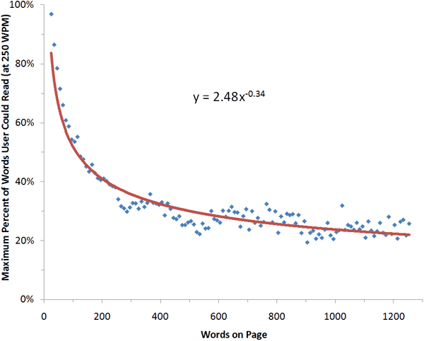
The financial advisory domain is characterized by a substantial volume of intricate data, encompassing market trends, diverse investment options, evolving regulations, and sensitive personal financial details. This abundance of information can present a significant challenge for both financial advisors and their clients. Without a thoughtfully designed storage hierarchy, individuals can easily feel disoriented, overwhelmed, and ultimately disengaged, which can impede effective decision-making. Research indicates that users typically read only a small fraction of the content on a webpage during an average visit, underscoring the critical need for information to be presented in a way that is quickly scannable and prioritizes the most pertinent details.
Maximum amount of text users could read during an average visit to pages with different word counts
Financial advisors work with a multitude of data streams—from market analyses and client portfolios to risk assessments and compliance reports. A well-defined information hierarchy can streamline how this information is communicated:
|
Prioritizing Data Points
|
|
|
Using Visual Aids
|
|
|
Structuring Reports and Presentations
|
|
Best Practices for Implementing Information Hierarchy
Here are some actionable tips tailored for financial advisors:
-
Define Your Core Message: Identify what information is most critical for your clients’ decision-making. Is it market performance, risk exposure, portfolio diversification or their financial plan?
-
Organize by Importance: Place the most impactful data at the top of your reports and files. Supporting details should be arranged to provide context without burying the lead.
-
Leverage Data Visualization: Use graphs and charts to represent quantitative data. Visual cues can help clients understand trends faster than raw numbers alone.
-
Test and Iterate: Gather feedback from clients on how they perceive your reports. Small adjustments in layout or phrasing can greatly improve clarity.
A well-structured information hierarchy not only makes your reports more professional but also builds trust. Clients feel more confident when they can easily navigate, find and understand the financial insights you provide.
Applying Information Hierarchy to SideDrawers
|
Prioritize Essential Functions
|
|
|
Organize Content with Visual Cues
|
|
|
Streamline Navigation
|
|
|
Adapt to User Behavior
|
|
Real-World Benefits for Advisors
1. Streamlined Workflows
By using a well-structured set of SideDrawers, your clients can quickly access high-priority information, reducing the time spent navigating through multiple screens. This efficiency is particularly important when dealing with time-sensitive market changes or urgent inquiries.
2. Improved Client Communication
When the SideDrawer is used to present organized and prioritized information, it becomes easier for you to prepare and share client-facing reports and presentations. Clients appreciate the clarity of insights, which can boost their confidence in your recommendations.
3. Enhanced Digital Experience
A carefully designed SideDrawer that adheres to information hierarchy principles not only improves usability but also contributes to a more professional and trustworthy digital experience. This can be a competitive advantage in a market where clients value both technological sophistication and clear communication.
Real-World Impact
Consider a scenario where an advisor is presenting quarterly performance. A report with a clear hierarchy might begin with a bold statement like, “Your portfolio increased by 5% this quarter,” followed by key factors that drove this performance. Detailed charts break down asset class performance, and bullet lists highlight market trends. This structure enables clients to quickly grasp the overview and dive deeper if they wish.
Data-driven communication is vital in a field where every percentage point matters - clarity in presenting financial data can significantly affect investment decisions and outcomes.
Conclusion
For financial advisors, mastering information hierarchy is about more than just design—it’s a critical tool for effective communication. By prioritizing and organizing content, you ensure that your clients receive the insights they need in a clear, actionable format. Embrace these principles to build more engaging, client-friendly reports that not only inform but also inspire confidence.
.png)
.svg)